Launch your business online with an experience your clients will love.
Limes Digital is your premier web design partner in Sydney. We help businesses serve their customers better through a gorgeous, buttery-smooth website.
Web Design
Let visitors see why your business is the right fit.
Your time as a decision maker is valuable, so we structured our process in a way that’s straightforward and works for you.
A website that just works
Serve customers with a website that’s fast, works on any device, and looks gorgeous - straight from the box.
Hassle-free changes
Have something you’d like to change, add, or fix? Give us a ping and we’ll respond in hours, not days.
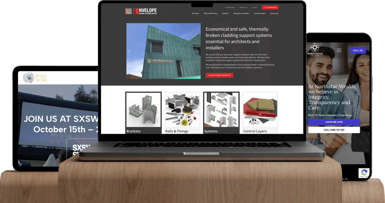
Organizations and businesses in Western Sydney launched confidently online with a beautiful website design
From small businesses to large organizations, Limes Digital's online strategy has produced website designs that helped them serve customers from Sydney to beyond.
Nvelope is a cladding system provider here in Sydney. Limes Digital designed and developed a website that lists their services for customers to easily browse.
Good service and clear communication. Manjula is very easy to work with and took time to understand my business. She was very kind and patient with the rework requests too.
Anish Awargal
Northstar Wealth
Interested to get your website up and running soon?


